DO YOU REALLY NEED A DYNAMIC WEBSITE
A website is essential for any organisation
In today’s digital age, having a website is essential for any business or organization. But with so many options available, it can be overwhelming to decide on the best type of website for your needs. One important decision to consider is whether to go with a responsive or dynamic website.
Most of the times the two terms – dynamic and responsive are used casually, without actually understanding what each means. So first, let’s define the terms:
How to choose your Website type
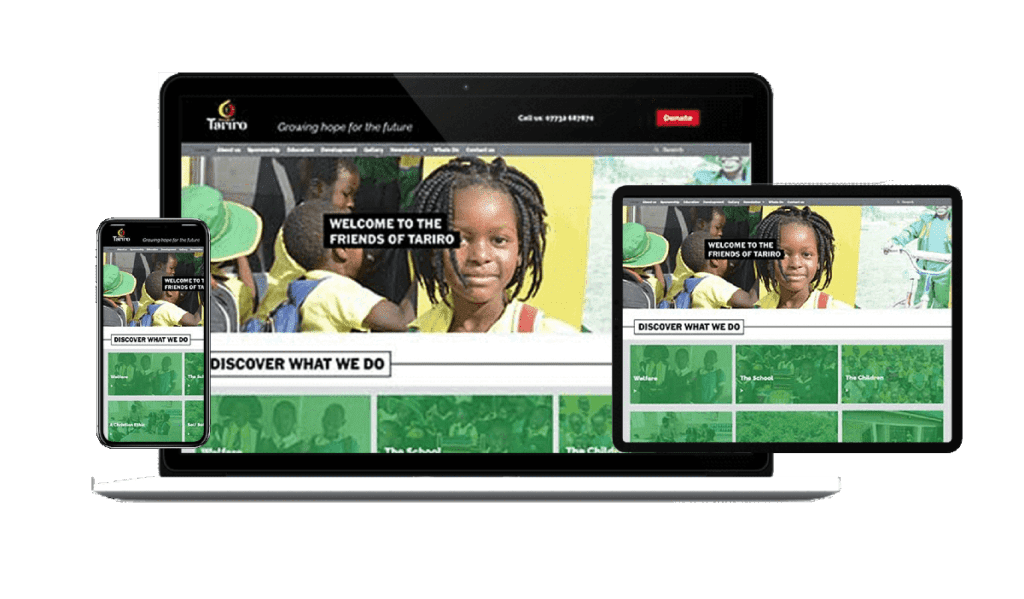
A responsive website is one that is designed to automatically adjust its layout and content to fit the device and screen size it is being viewed on. This means that a responsive website will look and function just as well on a desktop computer as it does on a smartphone or tablet. Thus, your customers, patrons and users will be able to view the site exactly as you published without losing any content or section. This in turn will help you retain and gain more customers or followers for your brand. This is why having a website is essential for any business or organisation.
A dynamic website, on the other hand, is one that is able to display different content or layouts based on specific conditions or user interactions. For example, a dynamic website might display different content for logged-in users versus anonymous visitors, or change its layout based on the time of day.
So why should you choose a responsive or dynamic website? Here are a few key benefits to consider:
- Improved user experience: A responsive website provides a seamless and consistent experience for users, no matter what device they are using. This is especially important given the increasing use of mobile devices to access the internet. On the other hand, a dynamic website can provide personalized and relevant content to users, making their experience more enjoyable and engaging.
- Better search engine rankings: Google and other search engines favour websites that provide a good user experience, including those that are mobile-friendly. By choosing a responsive website, you can improve your search engine rankings and make it easier for users to find your site. Dynamic websites can also be optimized for search engines, as they can easily update and add new content.
- Increased conversions: A website that is easy to use and navigate is more likely to convert visitors into customers. Responsive websites provide a consistent experience across devices, making it easier for users to take desired actions, such as filling out a form or making a purchase. Dynamic websites can also be optimized to display relevant content and calls to action based on user behaviour, increasing the likelihood of conversions.
In conclusion, both responsive and dynamic websites have their own set of benefits and can be the right choice depending on your specific needs and goals. A responsive website is a good choice for businesses that want to provide a consistent and user-friendly experience across devices, while a dynamic website is ideal for those that want to display personalized and relevant content.