LOGO STYLES
EVOLUTION OF LOGO STYLES

SINCE 1886
Logo design has come a long way since the turn of the 20th century. In the early 1900s, logos were often simply the company’s name written in a specific font.
As the field of graphic design developed and technology advanced, logos became more sophisticated and varied in their design.
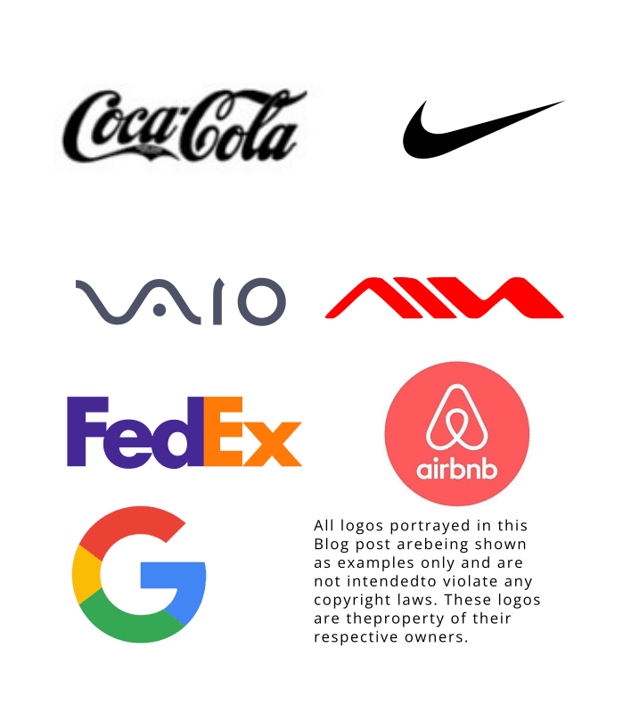
One of the earliest and most well-known logos is the Coca-Cola logo, which was created in 1886. The red and white color scheme and flowing script font have become iconic and are easily recognizable worldwide.
In the 1950s and 60s, logos began to incorporate more abstract elements and brighter colors. The Nike swoosh, introduced in 1971, is a prime example of this trend. The simple, curved line conveys movement and athleticism, characteristics central to the Nike brand.
As the field of graphic design continued to evolve in the following decades, logos became even more creative and diverse. The 1980s and 90s saw the rise of bold, geometric logos, such as the Sony VAIO logo and the FedEx logo. These logos used strong lines and shapes to create a modern, tech-savvy image.
In the 21st century, logos have become even more diverse, with many companies opting for hand-drawn, organic designs. The Airbnb logo, introduced in 2014, features a simple, hand-drawn “A” in a circle. The organic, friendly feel of the logo reflects the company’s mission of connecting people through home sharing.
As technology has advanced, logos have also incorporated animation and other interactive elements. The Google logo, for example, often features special designs or animations to celebrate holidays and other events.
Overall, the evolution of logo design reflects the changing values and aesthetic preferences of each era. As graphic design continues to evolve, it will be interesting to see how logos continue to change and adapt.